How to choose your kitchen colour: 5 practical tips

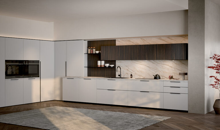
White or beige? Wood or colour? Dark base units and light wall units? To choose your kitchen colour, start by considering which combinations work in your home. The flooring, light, worktop and existing furniture can help you narrow down the options.
If you are unsure, start with the elements that will stay in the room and compare a few complete combinations: cabinet fronts, worktop and splashback. Looking at a colour on its own makes it harder to imagine the finished kitchen.
1. Start with the flooring and the elements you will keep
Before choosing your cabinet fronts, look at the flooring, window frames, doors and beams. Walls are relatively easy to repaint; replacing a floor is a different undertaking. It makes sense to start with the surfaces that will remain.
There is more to consider than whether a colour is light or dark. A grey floor may have beige, blue or green undertones; even two shades of white can look very different when placed side by side.
Compare samples directly, especially if you want a tonal combination. Two colours that look almost identical in isolation may reveal a noticeable difference when placed together.
HOW CAN YOU COORDINATE YOUR KITCHEN WITH THE FLOORING?
| Flooring | What to check |
|---|---|
| Wood or wood-effect flooring | If you also choose wood or wood-effect cabinet fronts, compare their tones and grain with those of the flooring. |
| Plain grey flooring | Check whether the grey has warm or cool undertones: this can provide a starting point for choosing your kitchen finishes. |
| Veined stone or marble | Identify the colours in the background and the veining. Compare the worktop too: two strongly patterned surfaces can compete visually. |
| Terracotta or reddish flooring | Consider whether you want to pick up the warm tones of the flooring or create a contrast. |
The flooring provides useful references when choosing kitchen finishes, whether you want to pick up some of its tones or create a contrast.
2. Consider where the colours will be used and how much light they will receive
A small door sample and a wall of tall units do not have the same impact. Position matters too: a dark colour used on the base units creates a different effect from the same finish extending across wall and tall units.
To assess the light, observe the room at different times of day. Where does sunlight fall? Which cabinets will remain in shadow? Will you use the kitchen mainly during the day or with the lights on?
The colour temperature of the lighting matters too: warm or cool lighting can change how you perceive the same colour. Compare samples under the lighting planned for the room as well.
DOES A SMALL KITCHEN HAVE TO BE WHITE?
No. A compact kitchen does not have to be white or pale: rich colours, dark shades and contrasting combinations can also enhance a small space and give it plenty of personality.
Your choice depends on the effect you want to achieve. You can create continuity with the walls or make the kitchen stand out with a bold colour, even across the entire composition.
To assess the result, consider the cabinet fronts, worktop, flooring, walls and lighting together. Floor area alone is not a sufficient reason to rule out a colour.
CAN YOU CHOOSE A DARK KITCHEN FOR A ROOM WITH LITTLE NATURAL LIGHT?
Yes, but the combinations and lighting need more careful consideration. Dark surfaces reflect less light and, if they cover much of the room, can make an already dim space feel darker.
If you want a brighter result without giving up dark cabinet fronts, focus on two aspects:
- The combinations: a light worktop, splashback or wall colour introduces contrast and breaks up the dark surfaces.
- The lighting: plan evenly distributed general lighting and dedicated worktop lighting, checking for areas that remain in shadow.
Before deciding, compare samples in the room with the lights on. This will help you assess whether you are achieving the cosy, enveloping atmosphere you want or whether the balance of colour and light needs adjusting.
3. Choose cabinet fronts, worktop and splashback together
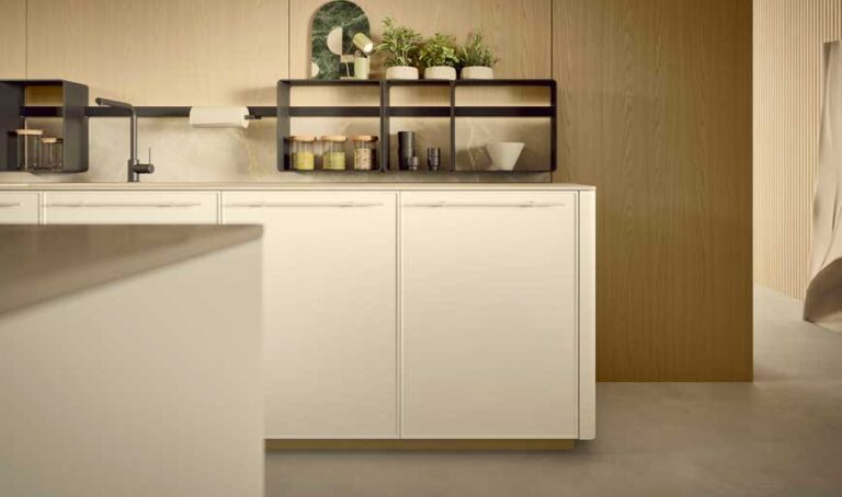
A white kitchen with a white worktop, one with a black worktop and one with a wood-effect worktop are three different proposals. Choosing the cabinet fronts first and leaving everything else until later can therefore make the decision harder.
Prepare two or three complete combinations. For each one, compare the cabinet finish, worktop sample and splashback sample with the flooring.
If you choose a worktop with pronounced veining, check how it sits alongside other patterned surfaces. Plain cabinet fronts allow the worktop pattern to stand out more clearly. If you also want wood, consider the grain, proportions and placement together.
WHY SHOULD YOU CHOOSE COLOUR AND MATERIAL TOGETHER?
Lacquer, Fenix, laminate, wood, stone and metal look different even when their colours are similar. Sheen, grain and texture affect how a surface reflects light.
Compare the actual material and finish that will be used, rather than relying solely on a colour reference.
IS A SINGLE-COLOUR OR TWO-TONE KITCHEN BETTER?
A single-colour kitchen reduces visual breaks between cabinets. A two-tone kitchen can distinguish different parts of the composition: base and wall units, tall units and the working area, or an island and the cabinets along the wall.
To decide where to use the second colour, consider the size of each group of cabinets. A run of tall units covers a substantial area: giving it a different colour changes the balance of the room more than a small open compartment would.
There is no need to follow fixed percentages. The amount of each colour should be assessed in the actual layout.
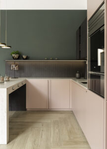
AN EXAMPLE: MAUVE AND OAK IN THE SAME KITCHEN
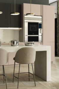
In the composition created by jrk design for the Dibiesse flagship store during Milan Design Week 2024, mauve Emporio cabinet fronts and matching Riga handles are paired with Area 22 wall units in a micro-grooved, heat-treated oak finish and an Atlas Plan worktop.
It is a practical example of how colour and wood can be combined.
4. Choose a colour that feels like you
If you like a colour and it makes you feel good, that is a meaningful reason to choose it for your kitchen too. Colour says something about the people who live in a home. You do not need to give it up simply because you worry about growing tired of it or because a neutral shade seems safer.
Think about the colours that recur in the spaces, objects and images you love. They can help you recognise a personal preference, even when you find it difficult to decide in front of the samples.
Trusting your taste and checking the combinations go hand in hand. Once you have identified your colour, compare it with the flooring, worktop and walls in the room’s light. The design should help bring out the best in your choice.
HOW DO YOU CHOOSE A KITCHEN COLOUR IN AN OPEN-PLAN SPACE?
Assess the kitchen from the places where you will see it most often: the sofa, dining table and entrance. Include the living room furniture and fabrics in your comparisons.
You do not need to use the same colour everywhere. You can repeat a wood finish, a shade or a metal detail, checking that the connection is clear within the overall space.
5. Before deciding, look at samples in your home’s light
Photographs and renders help you compare options, but they do not replace physical samples. Screens, photographic exposure and lighting can alter how a colour appears.
Whenever possible, take samples into the room where the kitchen will be installed. Look at them next to the flooring, both in daylight and with the lights on.
Position the cabinet-front sample vertically and the worktop sample horizontally, as they will be in the finished kitchen. Consider the finish too: matt, gloss and textured surfaces can look different even when their colours are similar.
For maintenance, ask for the care instructions for your chosen material. Colour and sheen can make some marks more or less visible, but they do not, on their own, tell you how durable or easy to clean a surface is.
CUSTOMIZING YOUR KITCHEN WITH RAL AND NCS COLORS
For matt and gloss lacquered finishes, Dibiesse also offers custom colours selected from the RAL and NCS colour charts.
You can therefore explore a specific shade with your retailer, comparing it with the other materials in the design. Choosing a colour code should be accompanied by checking the finish.
WHAT SHOULD YOU TAKE TO YOUR RETAILER TO HELP CHOOSE A KITCHEN COLOUR?
Bring photographs of the room, a flooring sample if available, and a few images of kitchens you like. Explain what you appreciate about each one: the contrast, the wood, the cabinet colour or the combination with the worktop.
Ask to compare two or three complete proposals using the same layout. Keeping the cabinet arrangement unchanged will help you understand which combination you really prefer.
Publication date: