Color is what you feel, not just what you see.

When we talk about color, we often think of it as an aesthetic choice. But it’s more than that.
Color is a sensory perception and a physical response.
Our brain reacts to the tones around us with real chemical reactions: some colors stimulate the release of endorphins, while others can trigger cortisol — the stress hormone.
And yet, many clients, when it’s time to choose, don’t trust their instincts.
They’re afraid of “getting tired” of a bold shade, of making a choice that feels too personal.
But the truth is, the color that makes us feel good… will never tire us.
Because it speaks about us. Because it represents who we are.
It’s not just about aesthetics.
In our work, we carefully select every shade that becomes part of our collection.
It’s not just about what’s “beautiful” or “trendy”, but about offering palettes that resonate emotionally, and give shape to spaces with personality and balance.
Trusting an authorized retailer helps identify what truly reflects you — even when you’re afraid to be bold.
A good consultant doesn’t impose color: they help you recognize the one that already belongs to you.
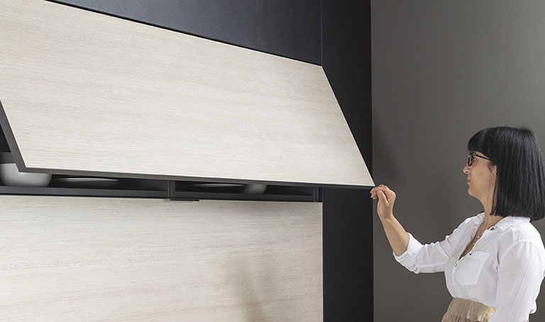
For those looking for an even more personalized choice, we offer the option to customize finishes by choosing directly from RAL or NCS color charts, available in both matte and glossy lacquer.
Because every project deserves its own perfect shade.
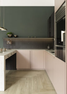
Color is making a comeback.
Neutral minimalism — made of whites, greys, and beiges — has dominated for years.
But today, color is returning with intention: not to overwhelm, but to highlight, rebalance, energize.
A colored worktop, a contrasting boiserie, a deep-toned niche — every detail can add character to a space.
And for those afraid of doing too much, there’s a simple, effective rule:
the 60–30–10 rule:
60% dominant color (walls, main furniture)
30% secondary color (complements, contrasts)
10% accent (details, accessories, finishes)
And you?
Take a moment.
Look around.
Does the color that surrounds you… make you feel good?
If you had to choose a shade that reflects your balance today, what would it be?
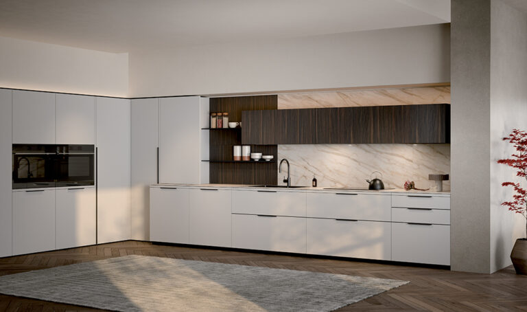
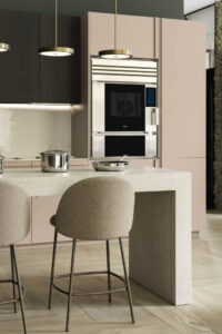
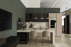
Composition by jrk design, created for Milano Design Week 2024.
Featuring: Emporio Malva with matching Riga handle, Area 22 wall units in micro-ribbed heat-treated oak finish, and Atlas Plan countertop.
Publication date: